
Helen is an Art Director and Multidisciplinary creative with a love for visual communication. Working alongside an award-winning team, Helen specializes in creating captivating and modern content with the soul.
What is a week of life look like for you? What do you do each weekday?
My typical week is broken up into various states of being. Three days in the office. A day shooting. A day of education, admin, and whatever else my business needs. Two days of rest. Then repeat.
Mondays are great for shooting where possible, it can be labour intensive and this way I make the most of feeling fresh and energised from the weekend.
Tuesday, Wednesday, & Thursday are typically days in the office, and while I don’t have set hours, I do try to keep it consistent and establish routine wherever possible.
Friday is a special day where I like to mix it up a bit. Continual education is so important, I love learning and have a very inquisitive mind.
My latest opportunities to learn new skills and processes have come from some great online courses. It can be hard to find anything modern in product photography & still life so I was excited to discover the Moodelier course package - it left me really inspired. I also love Karl Taylor, he’s kind of old school but he knows what he’s talking about, is a brilliant teacher, and I just love his tell-it-like-it-is attitude. I’ve also recently enrolled in various courses from SuperHi - coding, experimental type, digital project management - I’m looking forward to starting those. If I’m not learning on Friday, I’m busy with shoot prep or anything else that comes up in business or in life - no two weeks are the same.
In between all of this, family time is a high priority. After being at a significant distance for the last decade I now live within an hour of my immediate family and am deeply grateful for the shared moments.
How do you incorporate colors in your work?
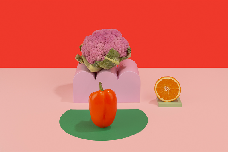
I love working with colour! It’s such an interesting topic, it’s very subjective and I enjoy the way it can impact the mood of a space, an image, or an object. I’m personally extremely sensitive to colour, I can be very discerning and have strong opinions on the topic, particularly when mixing hues and creating custom palettes for visual communication.
While I do love a bold and unexpected clash, my favourite way to use colour is to create a dynamic equilibrium balancing between unity and complexity. If I had to describe the way I use colour in one word, I would say delicately. Oddly enough, I have a very high spectral sensitivity which has been indicated with perfect scores in various optical colour vision tests, such as the X-Rite Pantone Hue Test. Colour accuracy is SO important working in a creative field and I love that I can really trust my eyes so implicitly. Right now my favourite combo is pink and green - think springtime, rosebuds, watermelon, palm trees against cotton candy sunsets - all the good stuff!
How do you define/find evergreen pieces/props that work for your aesthetic?
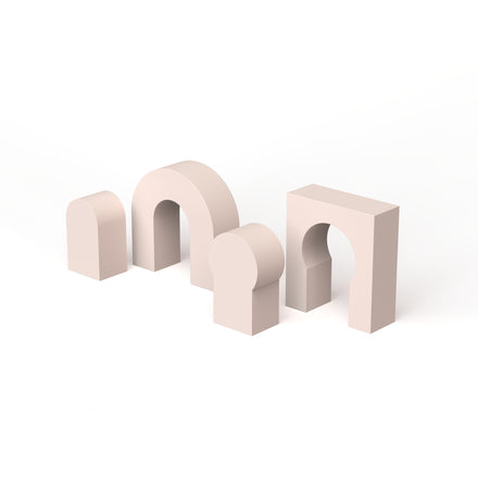
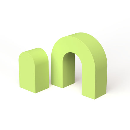
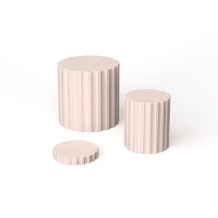
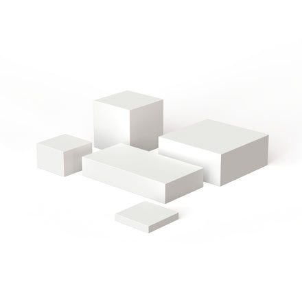
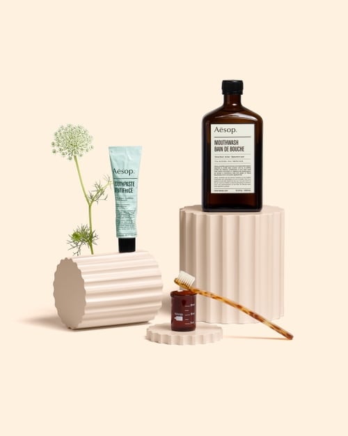
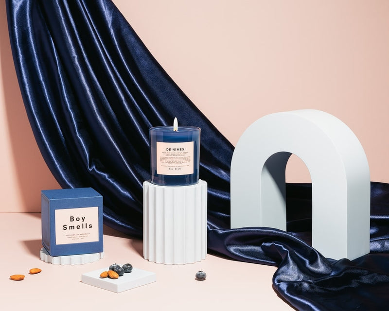
To me evergreen pieces and props are the kind of objects that work well with most brands and products, and a broad range of props and sets. Something that can be reused in multiple ways. My aesthetic is often quite minimal and clean, so pieces which fit within that work well for me. Risers in simple shapes, glass orbs, and wooden blocks are all in heavy rotation.
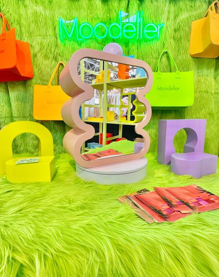
Moodelier has been such a valuable addition to my props library, I pre-ordered just about everything as soon as sales were open - I’d been on the hunt for pieces like these for what felt like forever and could never find anything perfect. My favourite is probably the cube bundle, it’s very minimal and just works so effortlessly with literally every single brand or object you could imagine. I’ve got multiple sets as it’s often handy to have blocks/risers/cubes in the same size to increase my styling options.
There are endless combinations to be created with each of the Moodelier pieces, and the option to paint them or change the colour in post-production means that they can be used again and again. Even with a single piece it can be used in multiple ways - whether it’s flipping it horizontally or vertically, changing your shoot angle to capture a whole new feeling, or using it as a full background.
Before finding Moodelier my options for risers were limited to whatever I could find on eBay or Amazon (hint, it wasn’t much!), or whatever I could create myself from the hardware store. It's really difficult to get a factory finish when you’re making something yourself, and little imperfections often mean more time spent in post-production which can really add up. I admire people who do a lot of custom set building, but it’s difficult and time consuming work, and is rarely an option with client budgets. I keep joking that I need to find a husband who works in CNC milling!
In terms of shopping for props, many of my most prized and treasured props have come from Vintage & Antique stores - brass candlesticks, sculptural busts, hourglasses, books, objet d’art, and specimens from nature have all been amongst my best finds. Fabric is another must for me, and depending on the shade you go with it can be about as evergreen as it gets. I love heavier fabrics that have beautiful drapes - velvet is a favourite and often catches the light beautifully.
Learn how to create stunning colourful visuals with Helen's class. Find out more here.


What is your favorite type of project to work on?
My favourite projects are often personal ones - they don’t rely on budgets, deadlines, client approvals or preconceived notions of what the outcome should be. I love the feeling of just creating for the sake of it, taking whatever inspiration strikes in the moment and not worrying about the commercial viability.
With that said I am extremely fortunate to have some brilliant clients who allow me creative freedom and trust my instincts to guide their brand storytelling through the images I create - projects with clients like that are a dream.
How do you incorporate Moodelier pieces and other props into your workflow? Can you show us some photo examples?
In the conceptualisation and ideation phase I like to create a list of potential props that could work for the project and concept I’m working on. Often this includes pieces in my props library along with items that I will need to source, such as fresh botanicals or directional pieces that are very specific to the concept in mind.
When creating my sourcing list digitally, it’s always helpful to try to add deep-etched images of the props I want to use in a column to the side, being mindful to keep them in relative scale to each other - seeing everything together is a helpful way to cull ideas. Another visual aid I use in my workflow is quick shot mockups - these can either be done in editing software like Photoshop, or by sketching - in which case I use Procreate on an iPad Pro.
The Moodelier pieces themselves are a lot of fun to play with, and many times I will just pull them out and experiment with them in a scene, there are so many different styles, silhouettes, shapes, and scales within the collection that I can always find something that fits, or is an unexpected twist in the scene. Sometimes this type of spontaneity and “breaking up” of my usual process can lead to much more creative outcomes (and more fun!).
What are your enneagram types?
My Eneaggram type is 4w3, which can be summarised as intense, expressive, goal-oriented, productive, authentic, artistic, creative, competitive, hardworking, restless, and romantic. These words all feel quite true to me. I also score very high on the 2w3 wing type.
Who and what are your inspiration currently? Any apps and accounts that we should follow that have been helpful or inspiring for you?
This is a tricky one because my inspirations are so broad and variable. They can change with any given moment, but there are definitely a few that have been a constant in my heart for many years.
Tim Walker - his work is pure magic.
Peter Lindbergh - he always captured such beautiful emotion.
Irving Penn - there is a raw quality to his still life work and his use of colour is quite intriguing to me.
Nature is perhaps the biggest constant - always and forever. I often find time spent observing earth and all its splendour to be the most inspiring thing of all. Driving past a beautiful meadow, finding wildflowers, swimming in the ocean, listening to the gurgling creek, admiring the colour palette of springtime, the sparkly night sky, the way sunlight dapples through leaves. Our world is endlessly magnificent.
Some of my favourite creators to follow on social media are @carl.otsberg, @ameliajdowd, @oghalealex, @miloch_com, @teresacfreitas, fleurette, @oscarpiccilo & @dellostudio, as well as inspiration accounts like @visualpleasuremag and @all__minimal.
I also love looking on SightUnseen.com, perusing my local library, or exploring the reports on WGSN and LS:N Global.
The list goes on - there are so many incredibly talented people out there, and some brilliant design resources available. It’s so important to keep your eyes open, and not just look for inspiration from the industry we’re in, but across all types of industries, mediums, and design - interiors, graphics, typography, fashion, architecture, the natural realm - there is always more to see.
We have recently collaborated with Helen with our New course Motion + Social Media Branding Course Bundle, you can check it out here
Photo credits:
All images by Helen Koker
Website: https://helenkoker.com/
Instagram: @helenkoker


New Comment