Teresa C. Freitas is a fine art photographer and content creator from Lisbon, Portugal. In her portfolio, you can find collaborations with brands like Netflix, Dior, Pantone and Polaroid. Teresa's artistry lies in composition and the conceptual way she uses colour, as a way to subvert familiar motifs into something less tangible and more cinematic.
Teresa Freitas
What does a week of life look like for you? What do you do each weekday?
I feel it’s important to establish a routine as a freelancer to work more efficiently, but sometimes that’s not always possible. It’s great to have the flexibility to change your week according to your needs. I’d say every week is a bit different, depending on the work or travel that I have coming up. Collaborating with a brand means communicating with the client, conceptualisation, creating a visual proposal, get the necessary props, producing the set design, shooting and post-production (this usually takes 1 1/2 week avg.). When I’m starting with the actual photoshoot, I hardly have the time for anything else during the day, although I try to catch up with priority emails in evening. But a “in between shoots day”, in times of lockdown due to the pandemic, goes something like this: catching up with the news during breakfast, working out, emails and other admin work until lunch; making lunch and going out for a walk; researching and planning for personal work/shoots; spending an hour or so engaging on instagram; more emails; and dedicating one hour of the day for the online-course I’m currently taking. Before lockdown, I’d take at least one day a week to go out shooting – I’m missing it!
How do you incorporate colors in your work, do you work with the same colors all the time?
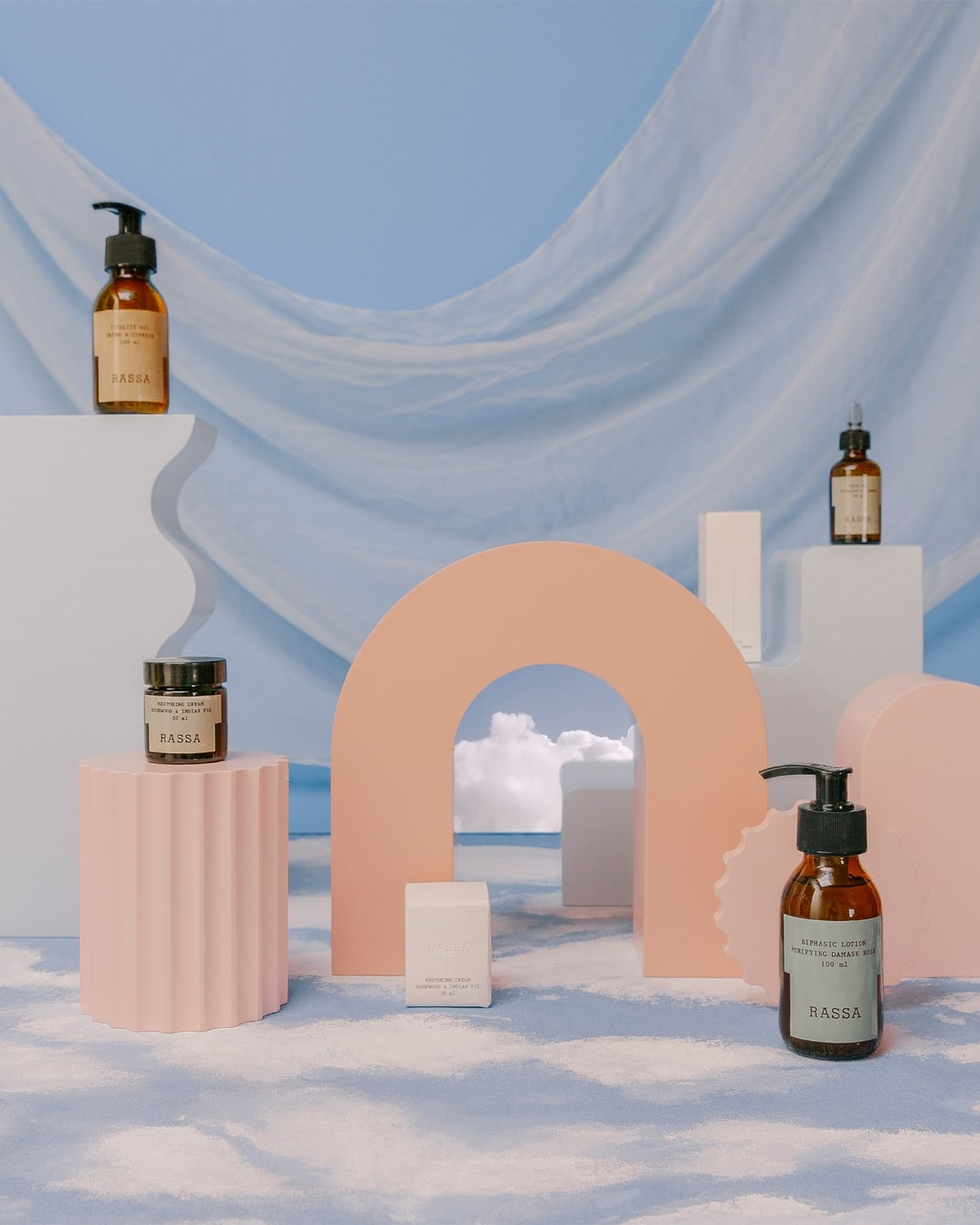
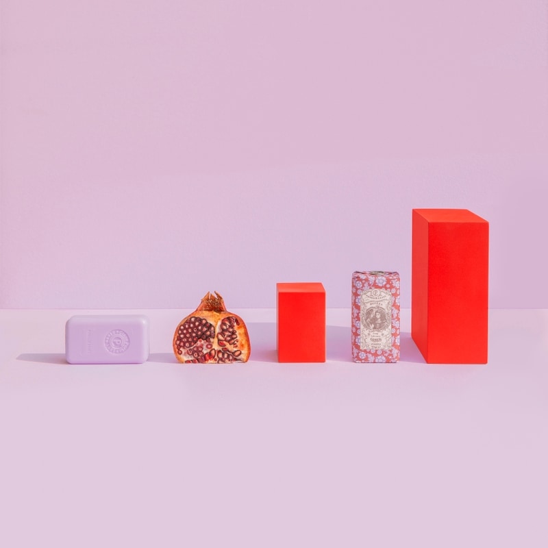
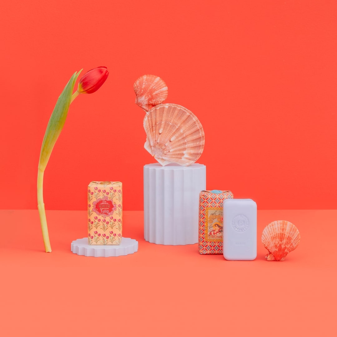
Colour is the most important part of my work. I’ve ended up developing an aesthetic style around it and it’s fundamentally what my images are known for, where I mix softer pastel colours with details of bolder tones. By mainly using tinted colours, there’s a dream-like mood that permeates the scene. For product photography, I really enjoy creating specific color palettes to fit the object I’m shooting, and how those specific hues and tones can portray and symbolize concepts that can be relatable to the product itself. I like to use all colours in their tinted states – blue, pink, orange, green... you will rarely see an image from me that’s shot with a white background, and you’ll never see black (which is a great colour nonetheless).
How do you define/find pieces/props that work for your aesthetic?
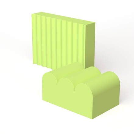
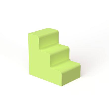
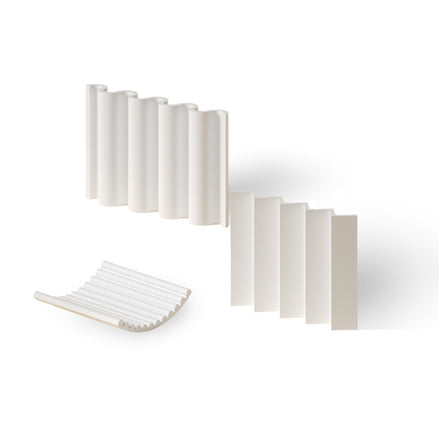
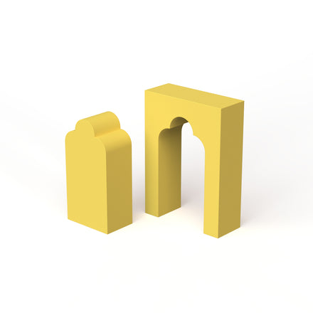
To define the prop(s) I’m going to use, it all starts in the conceptualisation of the shoot and the visuals and elements behind the brand – wether it’s packaging design, ingredients, the campaign, shape, purpose... I really like to find props that are reusable, like glass and colourful tumblers. I usually search in local shops or the flea market. Natural props, like flowers and fruits, aren’t really reusable, but I do work with those kind of elements a lot — they naturally fit with the brands I usually shoot for. Pieces like Moodelier’s are wonderful stands and evergreen pieces – they complement so many different type of objects, being really versatile and just down-right beautiful. Their creative minimalism and sublime lines makes them all the more usable, and perfectly-match with my style.
What is your favorite type of project to work on?
My favourite type of work is the one that takes me travelling. It also allows me to create personal-work at the same time, which makes it a great opportunity. At home, I really like shooting parfums. I’ve always loved perfume bottles’ design, the idea of scent and discovering the notes that create a fragrance. The connections we create from smell. It’s easy to get drawn to the type of ingredients that compose it, and get inspired with the props that make most sense to use. Fragrances always have a strong concept and context behind them which is something I really enjoy in my creative-process. I also really like shooting fashion editorials, although that’s not something that comes by very regularly.
Helen Koker

